En
En
 Es
Es
The list interface element is used in the platform for tabular display of objects with support for batch and per-item processing. Data and visual structure are defined via XML elements coldata and toolbar, while list behavior is controlled by metadata attributes. This article provides a complete specification of attributes, cell formats, and display logic under the client account.
metadata element
metadata
attributes define the key field and the field containing the message for confirming batch operations.
<xml>
  <metadata type="list" key="mgr" keyname="name">
    ...
  </metadata>
</xml>
metadata attributes
Note: fields with key elements may be unavailable to the user (may be missing from
coldata ).
coldata element
The
coldata
element contains
col
elements describing table columns.
<xml>
  <coldata>
    <col name="name" type="data" sort="alpha"/>
    <col name="intname" type="data" sort="alpha"/>
    <col name="orderpriority" type="data" sort="digit" edit="itemtype.edit"/>
  </coldata>
</xml>
col element
The col element describes a table column: data type, sorting, width, etc.
col element attributes
Localization
The column header is taken from localized messages by column name.
Detailed description (hint) is taken from localized messages by column name with the prefix hint_.
Column data types
Data in a column can be of several types. Defined explicitly by the @type attribute, implicitly — by the presence of prop, xprop elements or @sort=prop.
data or msg data type
The data type is set by the @type attribute with the value data or msg. The difference between them lies in data sources (localized messages or not), but this is handled by the platform. The developer should always take data from the elem element.
Each table row corresponds to an
elem
element. It contains values for each column. For the data type, values are taken from elements with names matching the column name.
The elem element can have additional data:
@color— row color.
<xml>
  <doc ...>
    ...
    <elem>
      <mgrname>core</mgrname>
      <name>COREmanager</name>
      <version>5.8.0-30.07.13_14:10_IRKT</version>
      <installed>on</installed>
      <avail_version>alpha (5.7.1-24.07.13_15:36_IRKT)</avail_version>
      <descr>Software complex core</descr>
    </elem>
    <elem>
      <mgrname>dnsmgr</mgrname>
      <name>DNSmanager</name>
      <installed>off</installed>
      <avail_version>beta (5.880.1), alpha (5.0.11-23.07.13_10:42_IRKT)</avail_version>
      <descr>DNS server control panel</descr>
    </elem>
    ...
  </doc>
</xml>
indicator data type
The data type is set by the @type attribute. Displays:
- limit;
- current value;
- a bar with the percentage ratio of the current value to the limit.
Can also be represented as two numbers, one of which is enclosed in parentheses. In this case, the element has the attribute @view=brackets.
@view=brackets attribute is supported only on the dashboard.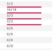
The limit value is taken from an element located in elem with a name matching the column name with the postfix _total; the current value — with the postfix _used.
<xml>
  <doc ...>
  ...
    <elem>
      <indicator_total>255</indicator_total>
      <indicator_used>101</indicator_used>
    ...
    </elem>
    <elem>
      <indicator_total>255</indicator_total>
      <indicator_used>82</indicator_used>
      ...
    </elem>
  ...
  </doc>
</xml>
prop data type
The prop data type contains properties and is set via the @sort=prop attribute or prop or xprop elements in the col element. Represents a string with icons.
prop
A property icon is displayed in the row if an element matching the property name is present in elem.
xprop
Extended prop, display of which depends on the element value. A property icon is displayed in the row if an element matching the property name is present in elem and the element value matches the @value attribute value. If the @value attribute is absent, xprop is displayed by default when the field value does not match the @value of other xprop elements with the same name. That is, the type works like prop, except when an xprop with the same name is already shown.
prop/xprop element attributes
prop localization
Detailed description (hint) is taken from localized messages by property name with the prefix hint_p_. If the message contains the __value__ macro, replace it with the value from the element.
xprop localization
Detailed description (hint), if a localized message with the name hint_p_<@name>_<@value> exists, is taken from it. Otherwise — from hint_p_<@name>. If the message contains the __value__ macro, replace it with the value from the element.
Mixed prop + data type
If col has the data type and prop or xprop elements, properties should be shown before the text. Everything else is similar to data and prop or xprop types.
card data type
The card type is set by the @type attribute with the value card. The cell becomes a link with a collapse button. When clicked, a list card with specific content expands.
The type of displayed content is set in the @card_content_type attribute on the column. Card data can be loaded both synchronously and asynchronously. Parameters for asynchronous data loading are set by the @card_parameters attribute on the column.
card column element attributes
Cards inside a list
Inside the table, it is possible to display cards between rows. The condition for opening a card is a cell in a column with the card type. Card type is specified in the column.
Card data can be specified in two ways:
- in case of synchronous data provision, they are located inside the cell data in the
card_datatag; - in case of asynchronous data loading, parameters are specified in
@card_parameters, and data comes in the root document element (<doc>).
Currently, there is only one card type — service-stat.
service-stat card type
This type is intended for displaying information about service resource consumption.
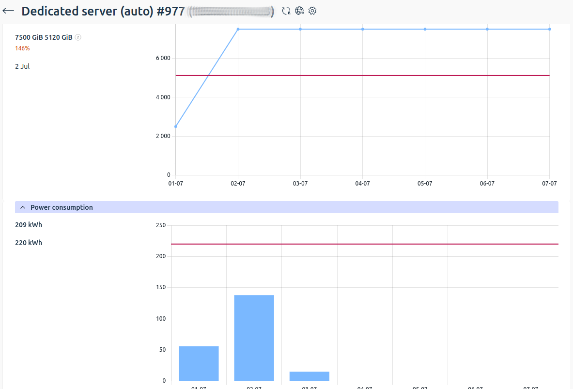
Example of service-stat card display in dragon.
Data for such a card is contained in the root document element in elem tags. Inside elem the following tags are contained:
It is also possible to add prop for internal cells. For this, prop is specified in the document root with an additional attribute @col, which specifies the name of the column in which the prop should be shown. The prop value comes inside elem by its name. prop attributes match regular props.
Text cells (name, stat, overspend) can be given a hint using the @hint attribute. The attribute value corresponds to a key in localized messages.
<xml>
  <doc ...>


    <prop col="overspend" name="overspending" func="service-stat" type="groupform" img="arrow-up-right-circle" sprite="yes" spritesvg="yes"></prop>
    <elem>
      <elid>3</elid>
      <name>Resource name</name>
      <stat>150 of 100 MB</stat>
      <progress color="red">150%</progress>
      <overspend>
        <link internal="yes" href="func=service-stat&clid=3&elid=10">50 MB | 1,234 RUB</link>
      </overspend>
      <overspending>Overspend for (month) (year): 1,234 RUB</overspending>
    </elem>
    ...
  </doc>
</xml>
Editing in a list
The presence of the @edit attribute on a column means that the cell value can be edited without opening the element edit form.
The attribute passes the name of the form function to call to get the control for this value, and then save it.
To get the form, a request is sent to the server with the parameters:
func— function name from the@editattribute;colname— name of the column in which the cell is located;tablename— list function;elid— identifier of the element being edited;plid— identifier of the parent list (if present);stylesheet— specify the valueeditinlist.
In response, the full element edit form will arrive, to which the editinlist.xsl template is applied. To display the form, a field is used whose name matches the name of the cell column. When editing a cell value, only the following controls can be used:
input[type=text][zoom, unlimit, date];select;select[type=radio];slider;textarea.
When forming a save request, include all form fields, including hidden input[type=hidden] fields. In the response, new elid and elname values (text value upon confirmation) may be returned if the new elid value does not match the old one. In this case, it is necessary to replace elid for further editing of the element.
Errors are displayed as notifications. For example, you can show a notification with an error text — the error element in the edit response.
Column sorting
The @sort attribute on the col element enables sorting by column. The @sorted attribute shows the sort direction and the column order in the sort. For example:
- +1 — first column in sort, sorted ascending;
- -2 — second column in sort, sorted descending.
Sorting occurs on the server side. Sorting can be by multiple columns. Columns are added to the sort by clicking on a column while holding CTRL.
Parameters added to the request to control sorting:
p_current— current sort state: names of sorted columns with sort direction in sort order (value of the@sortedattribute), separated by commas. For example:-time,+user;p_col— clicked column: column name and current sort from the@sortedattribute. For example:+time— column was sorted ascending;-time— column was sorted descending;time— column was not sorted.
When clicking without CTRL, an empty p_current is sent and p_col — the clicked column.
When clicking with CTRL, the current sort state p_current is sent and p_col — the clicked column.
alpha type sorting
Alphabetical sorting.
calpha type sorting
Case-insensitive alphabetical sorting.
digit type sorting
Sorting in numerical ascending order. Numbers can be both integers and fractions, both positive and negative. The field can accept not only numbers, so before sorting you need to remove everything extra and sort only by numbers.
indicator type sorting
Sorting for columns with indicators. Like numeric, but by the current _used value.
ip type sorting
IP address sorting. Can be both ipv4 and ipv6.
prop type sorting
Sorts prop or xprop by their presence. That is, for each row a number like 010101 is built, and then comparison occurs. If a property has the @sort=no attribute, then this property does not participate in sorting. If a column has a mixed type (prop + data), then with identical properties, text is also sorted alphabetically.
version type sorting
Sorting by versions separated by ., _, - symbols.
natural type sorting
Sorting that takes numeric sequences in strings into account. Unlike alphabetical sorting (alpha), numbers are compared by value, not character by character. For example, the sequence file1, file2, file10 with natural will be sorted correctly: file1, file2, file10, whereas with alpha the order will be file1, file10, file2. Applied to file names, versions with suffixes, and other strings containing numbers.
file type sorting
Specialized sorting for file managers. Elements are sorted in alphabetical order, with directories always displayed before files. Applied only in combination with the prop or xprop data type, when the column displays file or folder icons.
Pagination
When there are a large number of elements in a list, the list is broken into pages. The number of pages can be determined by the number of page elements in the root of the XML file. If there is more than one page, a pagination element (pager) should be shown.
page element may be absent in the root element of the XML file. The pagination element should be displayed if the attributes p_elems, p_cnt, p_num are present and the condition p_elems > p_cnt (more elements than fit on one page) is met.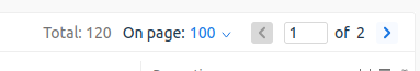
<xml>
  <doc...>
    ...
    <p_sort>time</p_sort>
    <p_order>asc</p_order>
    <p_cnt>50</p_cnt>
    <p_num>1</p_num>
    <p_elems>352</p_elems>
    ...
 </doc>
</xml>
With pagination, a field for entering the number of elements per page is assumed. The default value is passed in the p_cnt element.
To get the page selected by the user, add the parameter p_num with the page number, p_sort — value from the p_sort element, p_order — value from the p_order element, p_cnt — value from p_cnt or set by the user to the list request.
Localization
The message "Show" is taken from localized messages with the name pagershow.
The message "Lines per page" is taken from localized messages with the name pagerline.
Status bar
If the col element contains the @total attribute, statistics for the corresponding column are displayed in the status bar. The attribute is supported only for columns with numbers, indicators, or properties.
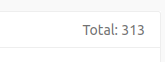
Example of status bar in dragon.
Status bar behavior
Data in the status bar depends on the number of selected table elements. If there are no selected elements in the list, the value of the @total attribute is displayed. When rows are selected, the system calculates and displays the sum of values only for the marked elements.
For a property column, icons with counts should be reflected in the bar.
It is assumed that under the first column the total number of elements is shown (from the p_elems element), and when rows are selected — the number of selected rows is shown.
If a number has a suffix, for example ("EUR", "RUB", "USD" ...), then the sum should be calculated separately for these suffixes and displayed via ;.
If a column has the attribute convert="money", then totals should be displayed in the format 100 000.00.
Localization
The message Total is taken from localized messages of the main menu with the name msg_total.
The message Selected is taken from localized messages of the main menu with the name msg_selected.
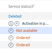
Row text and background coloring
If the
elem
element has the @color attribute, specify the row background in the color specified by the attribute. Available values:
red;green;blue;yellow;cyan.
If the element with the field data has the @color attribute, specify the row text color using the attribute. Available values:
red;green;blue;yellow;cyan.
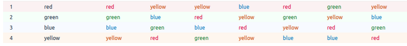
<xml>
  <doc>

 ...
 <elem color="red">
   <line_color>red</line_color>
   <text_color_1 color="red">red</text_color_1>
   <text_color_2 color="yellow">yellow</text_color_2>
   <text_color_3 color="yellow">yellow</text_color_3>
   <text_color_4 color="blue">blue</text_color_4>
   <text_color_5 color="red">red</text_color_5>
   <text_color_6 color="green">green</text_color_6>
   <text_color_7 color="yellow">yellow</text_color_7>
 </elem>
 ...

  </doc>
</xml>
Internal links
To display links inside a cell, you can send the tag
link
inside the cell tag.
<xml>
  ...
  <metadata>
    ...
    <coldata>
      <col name="id" type="digit"/>
      <col name="bundle" type="data"/>
      <col name="account" type="data"/>
      <col name="project" type="data"/>
      <col name="status" type="msg"/>
      <col name="cost" type="data"/>
      <col name="items" type="list"/>
    </coldata>
    ...
  </metadata>
  <elem>
    <id>1</id>
    <bundle>First set, minimal configuration</bundle>
    <account>Utkin N7x6V7r7N8 (cl8@test.com)</account>
    <project>Provider</project>
    <status color="green">Active</status>
    <cost>184260.75 RUB</cost>
    <items>
        <link internal="yes" newtab="yes" href="func=test_tp">20084
        </link>
        <link internal="yes" newtab="yes" href="func=test_tp">20085
        </link>
        <link internal="yes" newtab="yes" href="func=test_tp">20101
        </link>
        <link internal="yes" newtab="yes" href="func=test_tp">20103
        </link>
        ...
    </items>
  </elem>
  ...
</xml>
Table settings and CSV export
Each table has a settings form where you can set columns, sorting, number of elements per page. To call this form, call the tsetting function with parameters:
elid— list function name;plid— all parameters with which the list was called.
To export the list to a .csv file, add out=csv to the request parameters.
To export the list for printing, add out=print to the request parameters.
Localization
Detailed description of table settings (hint) is taken from localization messages with the name msg_tsetting.
Detailed description of export to .csv (hint) is taken from localization messages with the name hint_export.
Setting column width in a table
It is assumed that you can adjust the width of table columns. When adjusting column width, you need to send a request to the platform to save the width set by the user. For this, you need to call the colwidth function. In the parameters, you need to pass the column names and their size (size is assumed to be in percentages; it will be applied to the col element in the same units) without the % sign, as well as the elid parameter — the list function name.
id=6&name=18&user=12&host=17&pool=11&size=10&attached=25&func=colwidth&out=xml&elid=volumeFilter
Many lists have a filter that allows you to filter rows in the list. When a filter is applied, this needs to be displayed in the table, and a button is needed to remove it.
A message with the parameters of the applied filter is passed in the
p_filter
element. To remove the filter, you need to call the filter function (it can be taken from @func of the toolbtn element with @name=filter) with the parameter drop=on and reload the list.
<xml>
  <doc...>
 ...
   <p_filter>Login ~ admin, Access level = Administrator</p_filter>
  ...
  </doc>
</xml>
If you want to display filter icons, you need to check form values for non-empty fields, select not equal to '*', and checkbox not equal to 'off'.
Quick filter by list
A quick filter by list allows you to apply a filter by the current value of a table cell in the list.
A quick filter is applied to a column if:
- the column has the
@fastfilterattribute; - there is a
selectin the filter, and there is a corresponding column in the list.
Banners
Banners can be shown in lists. Banners are informational messages. They can be of three types: error, warning, and tip or information. A banner can have two links: Hide and Details.
The banner type (attribute @status) sets the banner color:
- error — red;
- warning — yellow;
- tip or information — green.
The banner message is passed in the msg element. If the banner does not have the attribute @pinned="yes", then the banner should be displayed as a pop-up notification.
<xml>
<doc...>
...
  <banner id="table_status_lastlogin" status="3">
    <param name="date">2013-08-01 11:07:31</param>
    <param name="ip">188.120.252.26</param>
    <msg>Last time you logged into the panel: 2013-08-01 11:07:31, from IP address: 188.120.252.26</msg>
  </banner>
...
</doc>
</xml><xml>
<doc...>
...
<banner id="table_status_lastlogin" status="3">
<param name="date">2013-08-01 11:07:31</param>
<param name="ip">188.120.252.26</param>
<msg>Last time you logged into the panel: 2013-08-01 11:07:31, from IP address: 188.120.252.26</msg>
</banner>
...
</doc>
</xml>banner element attributes
Banner behavior
The Hide link hides the banner and also sends a request to the platform that the user has hidden the banner and it can be not shown anymore. You need to call the dismiss function with the id parameter from the @id attribute. If there is an @infoelid attribute, its value should be passed in the elid parameter.
The Details link can open a list, form, or URL. If @infotype equals url or help, you need to open the URL from the @info attribute value. If @infotype equals func or formfunc, you need to open a list or form. The function name will be passed in the @info attribute, and if the @infoelid attribute is set, it should be passed as the elid parameter.
Error banner during batch operation
An error may occur during a batch operation. The XML response will contain a banner and possibly warning elements with the elements that caused the error.
You need to display the banner in the list, highlight elements from warning (the element identifier is set by the @elid attribute), display an error icon and a detailed message (taken from the msg element).
<xml>
<doc>

<warning elid="1973">
   <error type="account_delete_expense" lang="ru">
     <param name="group_id">1973</param>
     <stack>
       <action level="29" user="admin">account.delete</action>
     </stack>
     <group>Deleting clients with non-zero expenses is prohibited</group>
     <msg>Deleting clients with non-zero expenses is prohibited</msg>
   </error>
</warning>

<warning elid="1962">
  <error type="account_delete_payment" lang="ru">
    <param name="group_id">2546</param>
    <stack>
      <action level="29" user="admin">account.delete</action>
    </stack>
    <group>Deleting clients with credited payments is prohibited</group>
    <msg>Deleting clients with credited payments is prohibited</msg>
  </error>
</warning>

<banner id="groupfail_delete" status="1">
   <param name="count">94</param>
   <msg>Failed to delete 94 item(s). For details, hover over the error icon in the table row.</msg>
</banner>
<ok/>

</doc>
</xml>
Banner from a form
A banner may be in the response to a form submission. It needs to be displayed in the child list.
toolbar element
The toolbar element contains toolgrp elements (button groups), which contain toolbtn elements describing operation buttons for an element.
<xml> <metadata type="list">

 <toolbar>
   <toolgrp name="one">
     <toolbtn type="new" name="new" func="spec.list_a.edit" img="t-new" sprite="yes"/>
     <toolbtn type="edit" name="edit" func="spec.list_a.edit" img="t-edit" sprite="yes"/>
     <toolbtn type="groupform" name="groupedit" func="spec.list_a.groupedit" img="t-project" sprite="yes"/>
     <toolbtn type="group" name="delete" func="spec.list_a.delete" img="t-delete" sprite="yes"/>
   </toolgrp>
   <toolgrp name="two">
     <toolbtn type="editlist" name="sublist" func="spec.sublist_a" img="t-editlist" sprite="yes"/>
     <toolbtn type="window" name="window" func="void" img="t-invoice" sprite="yes"/>
     <toolbtn type="list" name="list" func="spec.list_refresh" img="t-liststart" sprite="yes"/>
     <toolbtn type="new" name="void" func="void" img="t-mime" default="yes" sprite="yes"/>
     <toolbtn type="refresh" name="refresh" func="spec.list_a" img="t-retry" sprite="yes"/>
     <toolbtn type="new" name="admin" func="admin" img="t-users" sprite="yes"/>
   </toolgrp>
   <toolgrp name="tree">
     <toolbtn type="group" name="setnull" func="spec.list_a.setnull" img="t-discount" sprite="yes">
       <hide name="text" value="hello"/>
       <hide name="admintext" value="hallo"/>
     </toolbtn>
     <toolbtn type="group" name="randomize" func="spec.list_a.randomize" img="t-iplist" sprite="yes">
       <show name="admintext" value="hallo"/>
     </toolbtn>
     <toolbtn type="new" name="filter" func="spec.list_a.filter" img="t-filter" sprite="yes"/>
   </toolgrp>
 </toolbar>

</metadata> </xml>
toolgrp element
Contains buttons grouped by common logic. In case the buttons do not fit in the area allowed for them, they should collapse into groups.
toolgrp element attributes
toolbtn element attributes
General description of button behavior
Buttons have two states: active and inactive. The state is set by the button type and hide or show conditions. A button can be hidden by the remove condition.
When clicked, buttons can open:
- list;
- form;
- URL address;
- operation confirmation window.
Button types
Button activation/deactivation
In addition to standard activation or deactivation of buttons depending on their types, there is a mechanism that allows forced:
show— activate the button;hide— hide the button;remove— deactivate the button.
When selecting a row, you need to check if the value in the column with the name from @name matches the value from @value of the hide, show or remove elements.
Forced activation cannot make a button active if such behavior is not provided by its type.
In hide, show or remove conditions, a column that is not shown to the user (missing from col) can be specified.
Localization
Button captions are taken from localized messages by button name with the prefix short_.
Detailed button description (hint) is taken from localized messages by button name with the prefix hint_.
Detailed description of an inactive button (by show or hide conditions) is taken from localized messages by button name with the prefix hint_ and the suffix _disabled.
Detailed description of an inactive button (by the number of selected rows) is taken from localized messages by button name with the prefix hint_ and the suffix _noselect.
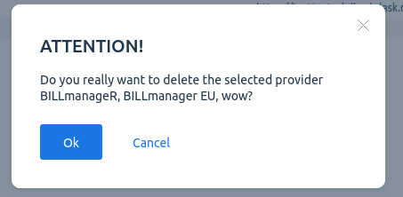
Messages for the confirmation window are taken from localized messages by button name with the prefix msg_confirm_.
Messages for the confirmation window for a large number of elements are taken from localized messages with the name msg_totalelem; macro _%s_ for substitution with the number of elements.
The element separator for the confirmation window is taken from the localized message with the name msg_confirm_delimiter.
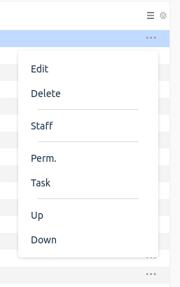
contextmenu element
The context menu is displayed when clicking an icon in a table row. Functionally, it completely repeats toolbar: hide, show, remove rules apply, display by groups.