 En
En
 Es
Es
This article contains an example of creating a dashboard to monitor the load of virtual machines (VMs). The monitoring data will allow you to identify VMs that create the highest load on the cluster node.
Creating and configuring a dashboard
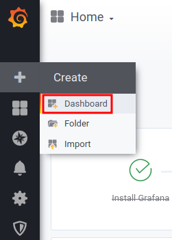
To create a dashboard:
- In the right menu of VMmanager, click the
 icon → Grafana. The Grafana interface will open.
 - Create a dashboard. To do this, in the left menu of Grafana, click the
 icon → Create → Dashboard. This will open a template for creating a dashboard.
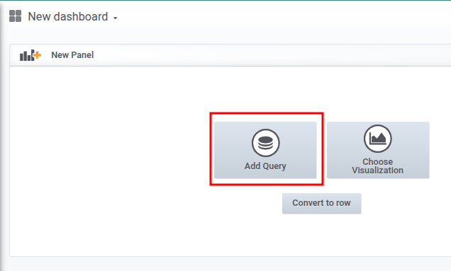
- Save the dashboard under a unique name. To do this, click the
 icon in the upper right menu → enter a name in the Dashboard name field → Save button.
 - Click the
 icon in the top right menu to add a panel to the dashboard.
 - Add a graph to the panel with information about the VMs with the most loaded CPUs:
- Click the Add query button. A template for creating a graph will open.
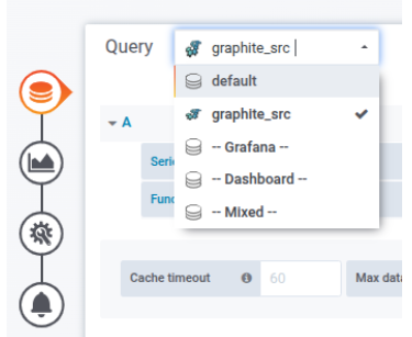
- In the Query list, select the graphite_src as a data source.
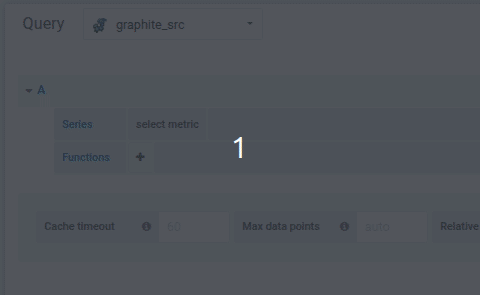
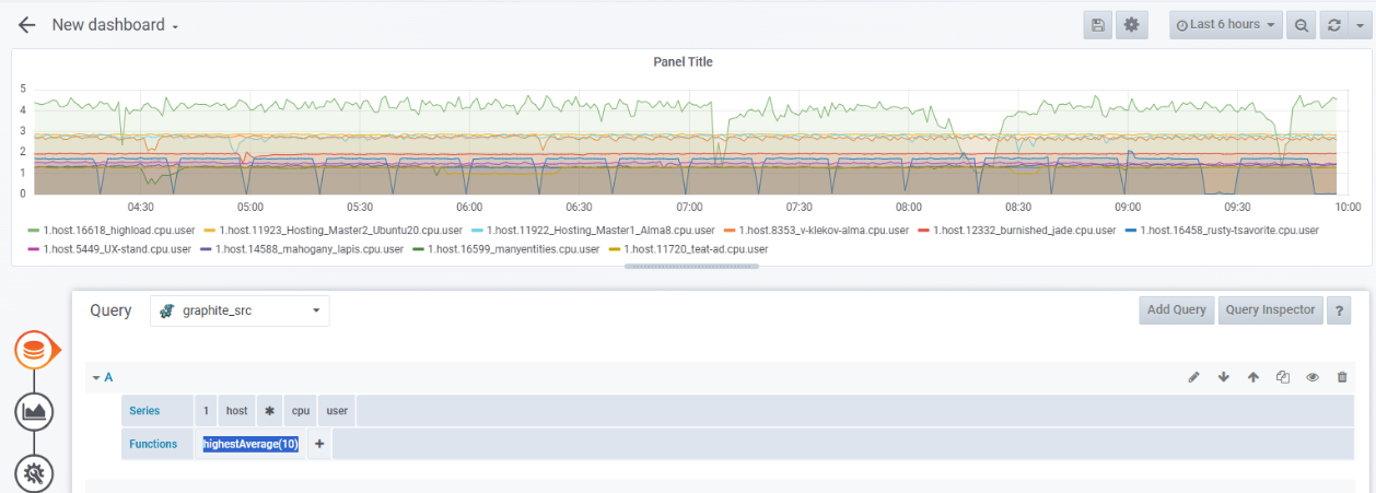
- In the Series line, select sequentially:
1— statistics database.host— statistics by VMs.*— all VMs.cpu— CPU load.user— user CPU time.
- To determine the 10 most loaded VMs, add the aggregation function
highestAverage(10). To do this, in the Functions line, click the icon → Filter Series → highestAverage → enter the number of VMs — 10. The graph will be displayed on the dashboard panel.
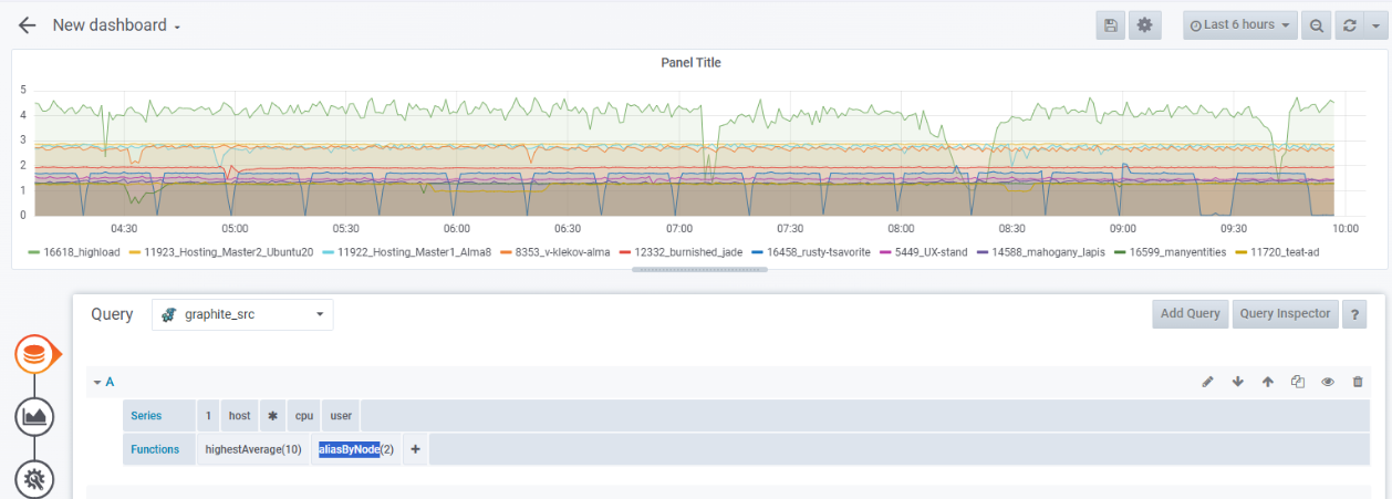
- To make the caption contain only the VM name, add the
aliasByNode(2)function. To do this, in the Functions line, click the icon → Alias → aliasByNode. The graph captions will change. By default, the graph caption format is as follows:1.host.VM_name.cpu.user.
- Click the Add query button. A template for creating a graph will open.
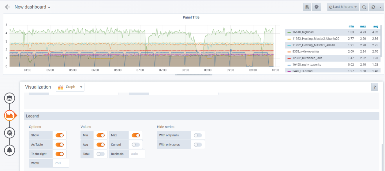
- Add a table view of the metrics showing the minimum, average, and maximum values:
- Click the
 icon . The Visualization section opens.
 - In the Legend section, enable the options:
- Show.
- As Table.
- To the right.
- Min.
- Avg.
- Max.
- Click the
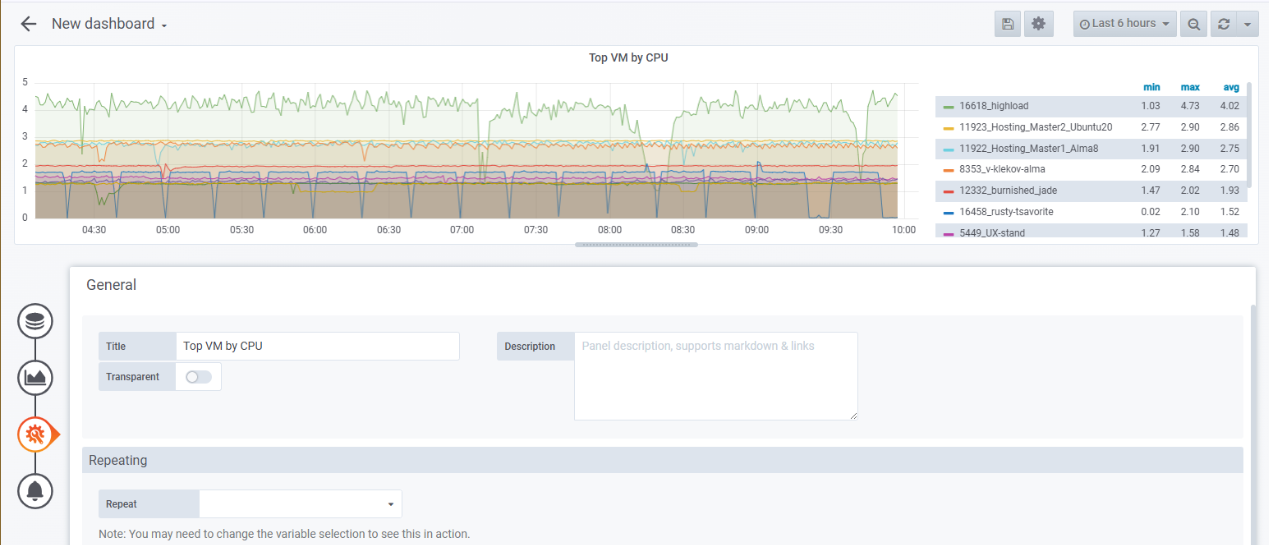
- Add a title for the graph:
- Click the
 icon . The General section opens.
 - In the Title field, enter the name of the graph. For example, Top VM by CPU.
- Click the
- To save the changes, click the icon → Save icon in the upper right menu.
- To add panels with graphs of VM utilization by RAM and network to the dashboard, repeat steps 4-8 with the following settings:
- When adding a graph of VM utilization by RAM:
- In the Series line, select sequentially:
1— statistics database.host— statistics by VMs.*— all VMs.mem— RAM.rss— RSS usage.
- In the Functions line specify the functions
highestAverage(10)andaliasByNode(2).
- In the Series line, select sequentially:
- When adding a graph of VM utilization by network:
- Set parameters for incoming traffic:
- In the Series line, select sequentially:
1— statistics database.host— statistics by VMs.*— all VMs.net— statistics by network.*— all network interfaces.rx— incoming traffic.bytes— bytes.sum— sum value.
- In the Functions line specify the functions
highestAverage(10)andaliasByNode(2,5).
- In the Series line, select sequentially:
- Click the Add query button.
- Set parameters for outgoing traffic:
- In the Series line, select sequentially:
1— statistics database.host— statistics by VMs.*— all VMs.net— statistics by network.*— all network interfaces.rx— outgoing traffic.bytes— bytes.sum— sum value.
- In the Functions line specify the functions
highestAverage(10)andaliasByNode(2,5). - The
aliasByNode(2,5)function displays only the VM name and traffic type — incoming (rx) or outgoing (tx) — in the graph caption.
- In the Series line, select sequentially:
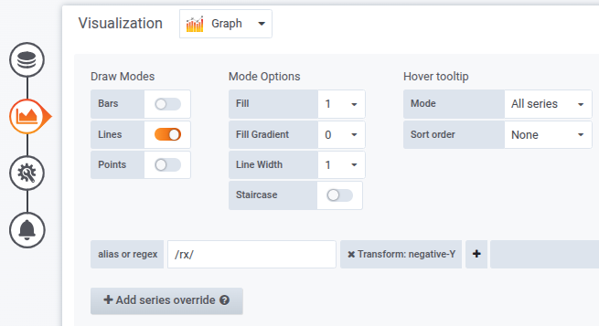
- To make the graph of incoming traffic (rx) mirror the graph of outgoing traffic (tx):
- Click the
 icon . The Visualization section opens.
 - Click theAdd series override button.
- In the alias or regex field enter:
/rx/ - To the right of the alias or regex field, click the icon → Transform → negative-Y.
- Click the
- Set parameters for incoming traffic:
- When adding a graph of VM utilization by RAM:
You can move the graphics to the desired locations on the dashboard and set their size with the mouse.

Viewing statistics
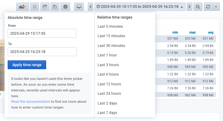
To view statistics for a specific period:
- Click on the date in the upper right menu.
- Select the desired period in the Relative time ranges column or enter the period boundaries in the From and To fields.
- Click theApply time range button.
Useful tips