 En
En
 Es
Es
BILLmanager supports branding — creating a unique look and feel for the platform web interface. The provider can:
- set a color scheme;
- upload the company logo;
- configure how copyright information is displayed;
- configure the login form;
- set up a dark theme and let users switch to it.
Branding configuration
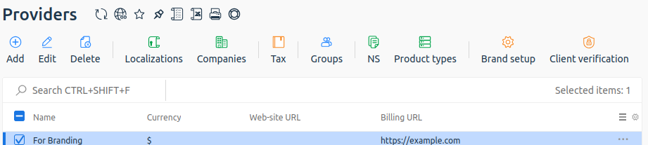
To brand the interface, in the main menu navigate to Provider → Providers → select the provider → click the Brand setup.
General
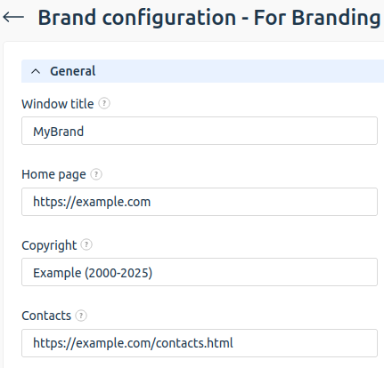
The General section contains the following settings:
- Window title — the page title displayed in the browser tab;
- Home page — the company website. Clicking the copyright link opens the specified page;
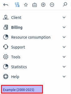
Enter the address of your company's main website, not the platform server, in the Home page field. For example,https://example.com, nothttps://billmanager.example.com. - Copyright — copyright text identifying the physical or legal entity holding the rights to the resource. This is a link to the homepage. It is displayed:
- at the bottom of the platform's main menu;
- at the bottom of the login page.
- Contact — a link to the company's contact details. It will be added to the login form.
Logo
The Logo section contains the following settings:
- Link on the logo — the URL opened when clicking the logo;
- Main logo — the brand logo located in the top-left corner of the platform interface. Maximum display size is 245x30 pixels; supported formats:
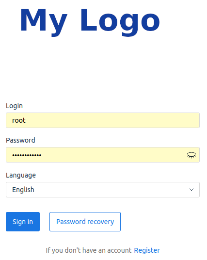
PNG,SVG; - Authorization form logo — the brand logo displayed on the login page. Maximum display size is 400x200 pixels; supported formats:
PNG,SVG;
- Address bar icon (favicon) — the icon displayed in the browser tab before the page title. Maximum size is 16x16 pixels; supported format:
ICO.
Logo for dark theme
The Logo for dark theme block contains settings that will be applied when using dark theme:
- Main logo — the brand logo shown in the upper-left corner of the platform interface. Maximum display size is 245x30 pixels, supported formats:
PNG,SVG; - Login form logo — the brand logo shown on the login page. Maximum display size is 400x200 pixels, supported formats:
PNG,SVG;
Login form
To customze the login form, in the Login form section:
- Click Go to settings.
- Configure:
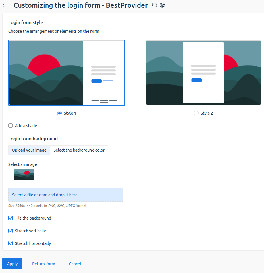
- Login form style — select the style and layout of elements on the login form:
- Style 1 — on the right side of the page;
- Style 2 — centered on the page;
- Add a shade — enable the option to add a shadow under the login form;
- Login form background:
- Upload your image — Select an image for the image and its position on the page (the Select an image and Select an image for the dark theme options).
- . Available options:
- Tile the background;
- Stretch vertically;
- Stretch horizontally;
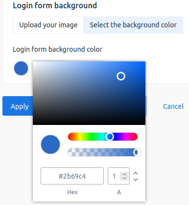
PNG,SVG,JPEG; - Select the background color — enter a HEX color code or use the widget to select it.
 To restore default settings, click the Restore form button.
- Login form style — select the style and layout of elements on the login form:
- Click Apply to save changes.
All style setting changes are reflected in the preview area.
Interface color
You can use your corporate colors in the platform interface. In the Interface color section, click Go to settings:
- Select the platform section: Home, Table, Form.
- In the preview area, select the element whose colors you want to change.
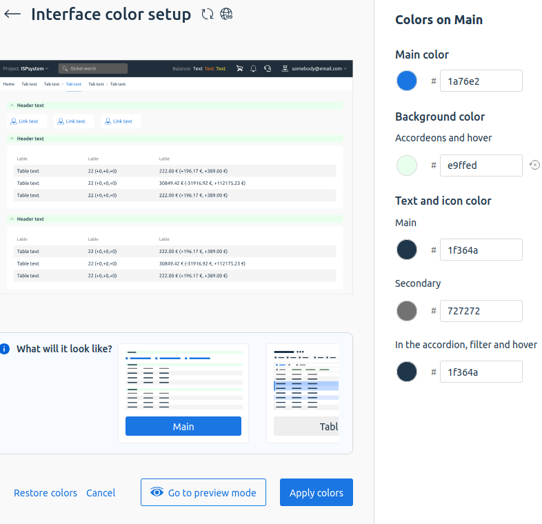
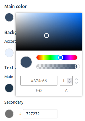
- In the right panel, enter a HEX color code or select one using the widget.
All changes are visible in real time during interface preview. Some colors are shared across sections. For example, Main color determines the appearance of active buttons and interface fields.
To restore a modified color to its default, click the undo icon next to the field.
- Go to preview mode. In this mode, you can switch between interface sections.
- Apply colors to the provider's user interface.
Click Restore colors to restore default settings.
You can Cancel unsaved changes.
Theme switching
You can configure theme switching. The Theme switching block has the following options:
- Disable — dark theme is turned off. Default option;
- Enable — if this option is selected, users can choose which theme to use in the upper-right corner:
-
 — light theme;
 -
 — dark theme;
 -
 — automatic theme selection depending on the browser settings .
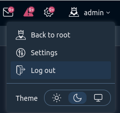
Theme selection menu
-
- For employees — if this option is selected, the dark theme is visible only to provider employees.
Configure theme switching:
- Import images from the light theme — if the option is selected, the dark theme will show logos and the login form background from the light theme. If custom images have already been uploaded for the dark theme, the images will remain unchanged.
- Default theme value — choose which theme will be used by default. Available options:
- As on the device — the theme configured in the user’s browser will be used;
- Light theme;
- Dark theme.
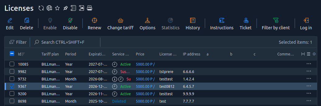
HTML insertion
All platform pages are created using:
- HTML markup;
- CSS styles;
- JavaScript code.
To create additional branding for the platform, from the interface add your own HTML/CSS/JavaScript code to the existing BILLmanager page code.
In the HTML insertion section, there are fields for:
- Head — code from this field will be appended to the end of the header block (<head> </head>) on every page;
- Body — code from this field will be appended to the end of the body block (<body> </body>) on every page.
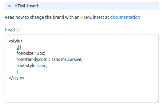
For example, to change the font of the main menu, add the following code to the Head field:
<style>
	li {
    	font-size:12px;
    	font-family:comic sans ms,cursive;
    	font-style:italic;
	}
</style>
The code in the example:
- overrides the default styling of the list element (<
li>); - sets the font size to 12 pixels;
- applies the
comic sans msfont; - activates italic styling.
Reset settings
To restore default settings, enable the Reset settings option and click Apply.